Tuesday, November 30, 2010

Something Completely Different!

So, as an aside to the current Carnivean project, I've been itching to execute some of the ideas I've had for my Retribution models. I've hated how all the heavies have the same set of legs, and all the lights have the same set of legs.
Stock pose for the Heavy Myrmidon Kit
 Their arms are fairly pose-able being 3-4 parts, but the legs are just in these boringly static positions. For a race built on grace and speed, that just won't do!

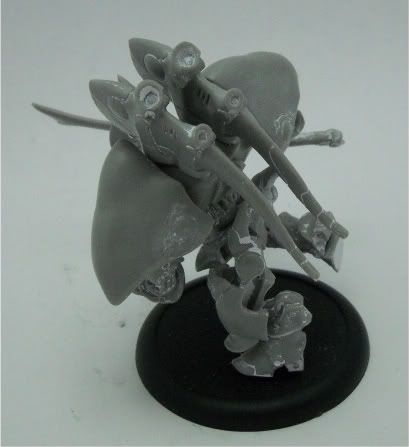
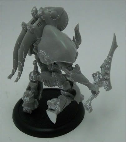
So, here's what I did to my Phoenix. First, I decided that since a Phoenix is such a staple 'jack, I needed one basically at all times, thus it was worth gluing one together (and not magnetizing). It also helps that I got the 'jack second hand, and that was the configuration that the original owner had chosen. The head and upper arms were solidly glued on, and despite the freezer and many minutes of trying, they wouldn't budge. The head was also pretty well stuck, so that dictated part of the pose as well.

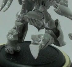
Since my biggest issue with the kit was the legs, it was my starting point. I picked the leg that's typically a bit forward, and cut at the "ankle". I then rotated the foot backwards into a "just leaving the ground" type position.  When I put the whole legs & waist assembly together, the waist sat too parallel to the floor.  So, I drilled out the hole on the leg I left alone, swamped it with glue and set the waist to a more forward tilted angle.  Once it's all put together, the lower torso looks a bit like so:
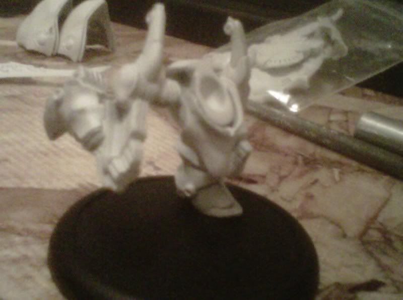

Photobucket


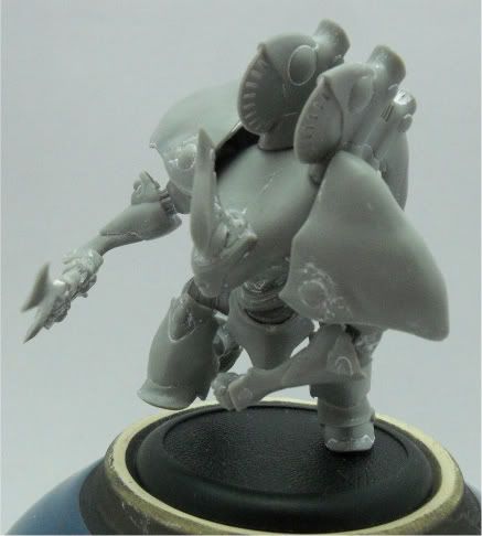
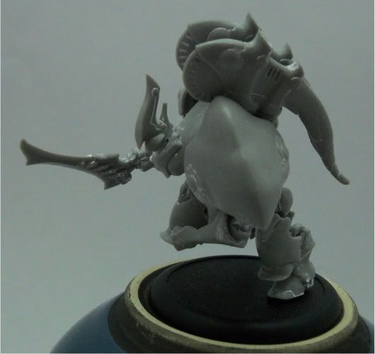
So, with the back leg looking like it's on it's way forward, and the other leg mid stride, the 'jack is obviously charging.  So, the arms need to match the movement.  If you've ever watched someone run, you'll notice that the limbs that are opposite each other (left leg & right arm, right leg & left arm) always swing in opposite directions.  So, the arm opposite my forward moving leg needed to look like it was on the back swing, and the arm opposite the leg planted on the ground needed to be on it's way forward.  That was achieved by putting the left arm in front of the torso, and the right arm a bit behind.  Like so:
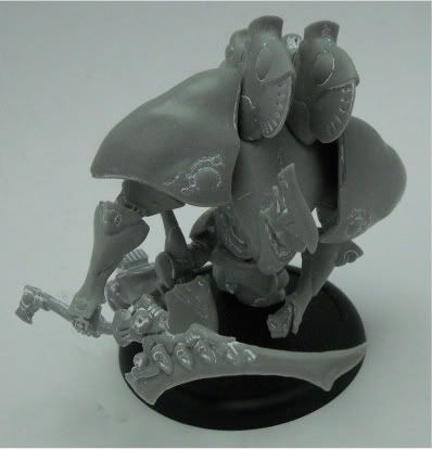

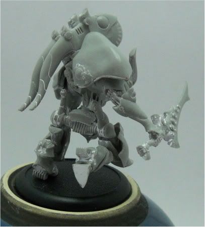
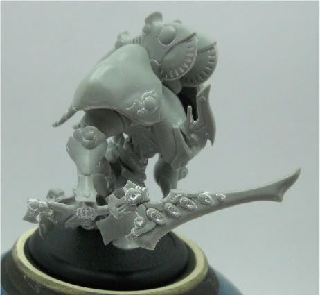
To me, the overall pose looks as if the 'jack is about to flip the sword over for a two-handed type downward stroke.  The pose isn't terribly animated, but leaves lots to the imagination.  Here's a whole bunch more shots (click to see larger versions).

PhotobucketPhotobucket
Photobucket

So.  Now the big question.  What colors do I paint it?!?

Monday, November 29, 2010

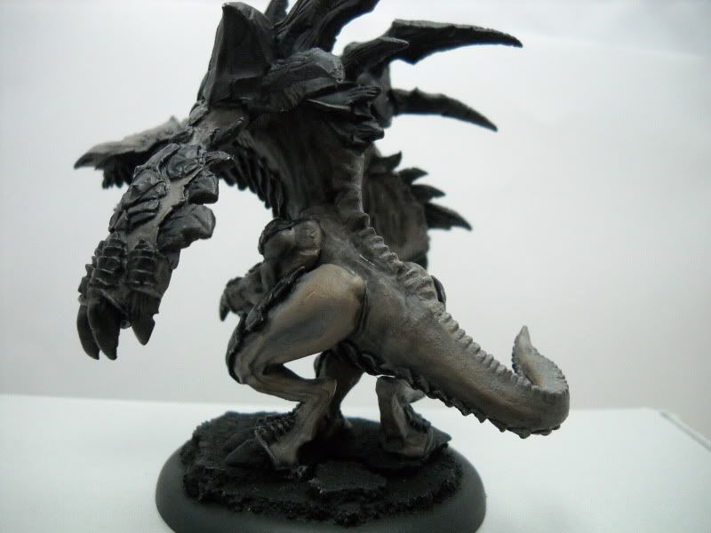
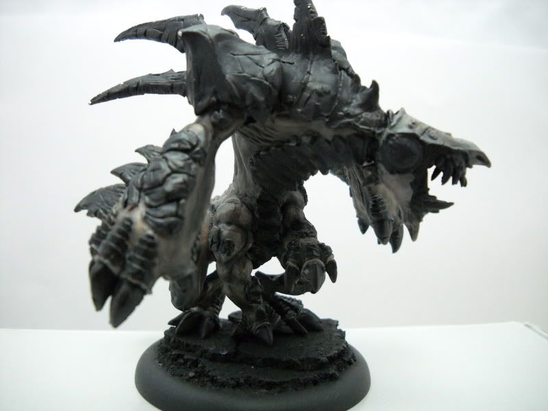
Carnivean WIP 3

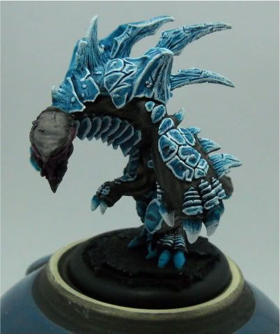
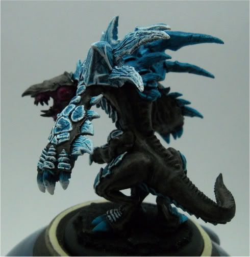
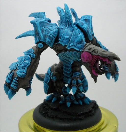
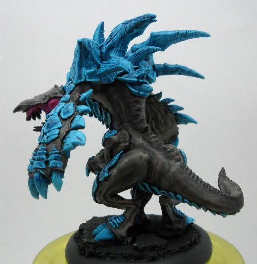
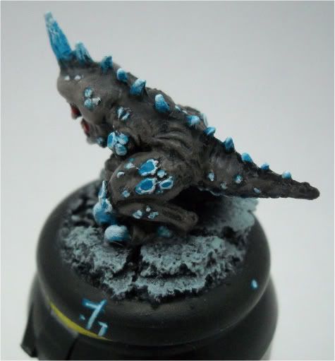
Well, finally got some white down, and I think it looks pretty good. I wasn't happy with it at first, but after some blending to get the bold outlines to look a bit more natural, I think it looks decent enough! I think the plates on the flipper need a bit more blending, but overall, what do you think?

Photobucket
PhotobucketPhotobucket

Post your thoughts below!

PS:  Side project update tomorrow.  I have to be up for work in about 5 hours, so tonight's not the night for a whole new entry detailing what went on.  Tomorrow, I promise!

Sunday, November 28, 2010

Carnivean WIP 2

Howdy, howdy, howdy!

I hope everyone had a good holiday weekend! I know I stuffed face, fell asleep and thoroughly pigged out. Whoo!

I got a layer of 1:1 Hawk Turquoise : White down on the Carnivean's armor while watching the original Tron movie. It was an interesting experience to say the least. Without further adieu...

Photobucket
PhotobucketPhotobucket

I'm not entirely sure why, but I feel funny today. I'm not sure if it's all the staying up late and sleeping in, or the fact that with DST kicking in a few weeks ago, I'm still feeling mixed up. (When it's nightime at 5:30, around 10pm I think my brain says "Time to sleep" and my body still has energy, so i'm getting all confused)

Pics of the side project tomorrow, plus a bit more.

Tuesday, November 23, 2010

Carnivean WIP

Alright, so I definitely missed my weekend goal of finishing the Carnivean.  It's not because I got lazy... The weekend was far more adventurous than anticipated, honest!  We had planned on going to see HP7 Sunday morning, but it was sold out instantly, so we waited around for about 2 hours to see Red.  After that, we ventured into the District (Washington DC) to enjoy dinner at Five Guys, followed by about 2 hours of exploration at the Smithsonian American Art Museum / Portrait Gallery.

What I was able to get done between Sunday and last night was this:
Photobucket
PhotobucketPhotobucket

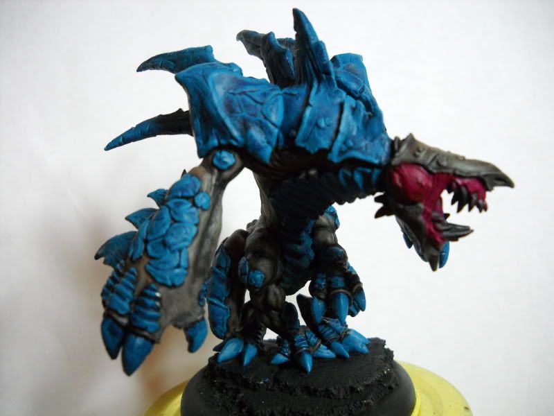
The armor has quite a bit more shading after a wash with Asurman Blue and after that dried, I brought non-recessed areas back up to the base coat color, Hawk Turquoise.  The next step is to highlight with 1:1 turquoise and white followed by pure white.  Hopefully I'll have half that done tonight.

Also, the gums are 2 layers of Warlock Purple with a Baal Red wash.

Here's also what captured some of my attention last night.  See if you can guess what's going on (excuse the hurried cell phone picture)...

Chaaaaaaarge!

Sunday, November 21, 2010

Foodmachine and Carnivean WIP

So, I had an absolute blast today at the Foodmachine event up at Dream Wizards in Rockville.  I played a few games against some great opponents and cheated for charity!  We were able to donate over 600 cans among the 14 of us that participated, and all for charity!  Huzzah!  Big thanks to Nate (PG_CrashTestDummy) for putting the event together!

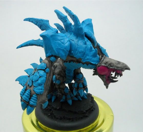
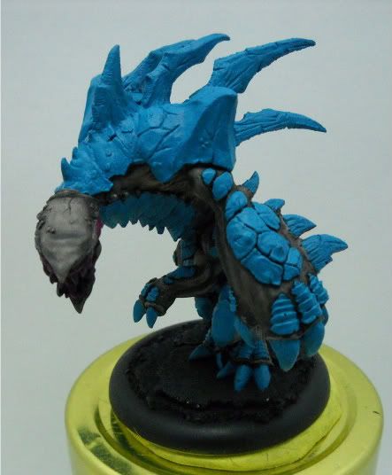
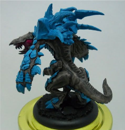
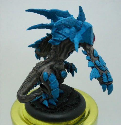
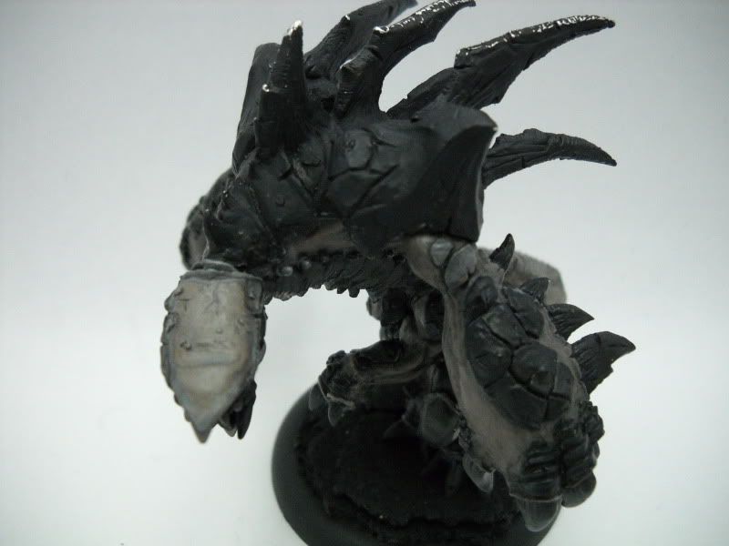
After the event, I got home and was in a good mood, so I was able to power through some more work on the Carnivean.  A layer of highlights and a followup wash finished the skin, and a careful, slow, tedious basecoat of Hawk Turquoise went down on all the chitin.  I also hit the maw with a bit of Warlock Purple.

Here's the Carnivean WIP:

PhotobucketPhotobucket

I realize the basecoat isn't terribly flashy, but it does help set the tone for the model. I really think the balance between turquoise and the skin works. Neither feels terribly over powering.

What do you think? Did the skin turn out well? Does the model feel balanced to you?

Also, do you like the new format of small pictures in a tile setting like this, or do you prefer the big pictures in a column like my older posts (like this one)?

Let me know what you think!

Saturday, November 20, 2010

Third time's the charm! (Lylyth)

So, after quite a bit of input from the Privateer Press Forum, I've addressed a few problems with my scheme.

First, my beast skin lacked depth - This was fixed with a layer of highlights followed by a watered down black wash. I also re-highlighted the shredder's scales and added just a touch of white to his spines.

PhotobucketPhotobucket


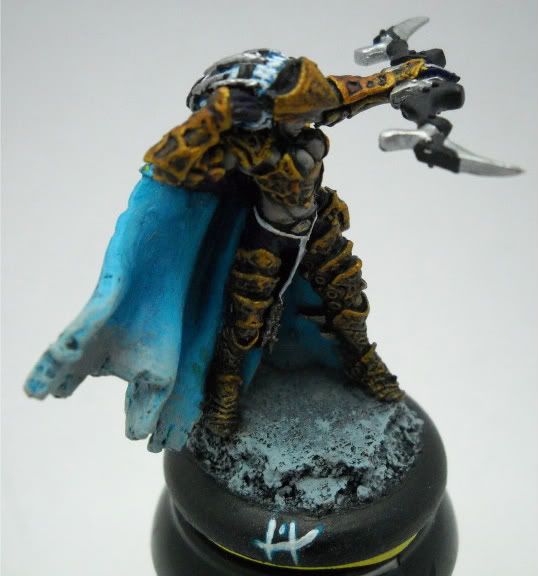
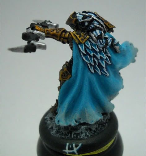
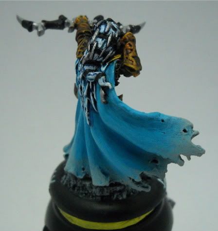
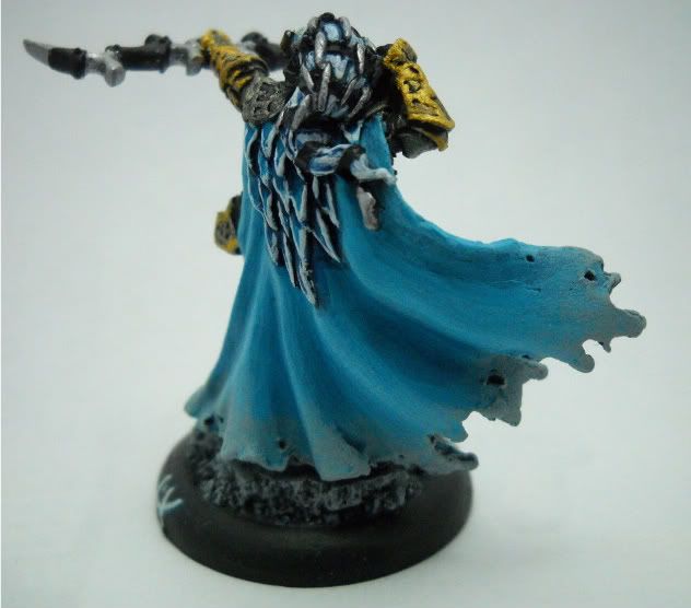
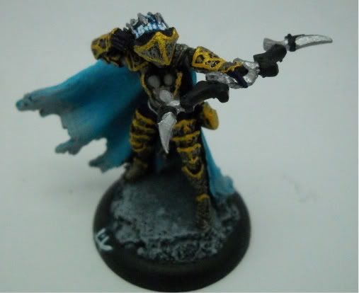
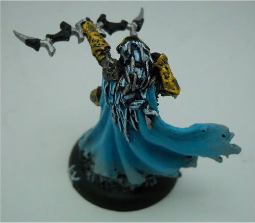
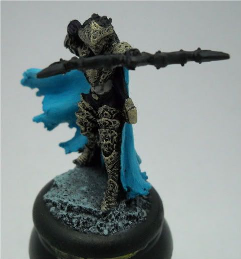
Secondly, Lylyth's armor was way too bright, and the highlights far too thick. I blended in the highlights a bit and then knocked down the brightness of the armor with two brown washes and a black wash. This way, I kept the depth and texture but dimmed the glaring brightness. I also used a watered down blue wash to smooth her cloak a bit - this also deepened and enriched the color just a tad.

PhotobucketPhotobucket
Photobucket

Lastly, I was able to get the first layer of skin down on the Carnivean! This is 3 layers of skin tone (basecoat Grey -> 1:1 Grey and Flesh -> 1:3 Grey and Flesh) followed by a strong black wash, concentrated on the recesses and folds of the skin. From here, he'll get a nother coat of the 1:1 and 1:3 and then a watered down wash to finalize the skin.

PhotobucketPhotobucket

I'm hoping to get the Carnivean done this weekend.  Stay tuned (Subscribe)!

Tomorrow is Foodmachine at Dream Wizards in Rockville.  I'm fairly excited to get to play some more games, and hopefully I'll have some pictures from the event!


Thursday, November 18, 2010

50th post - Battle Report

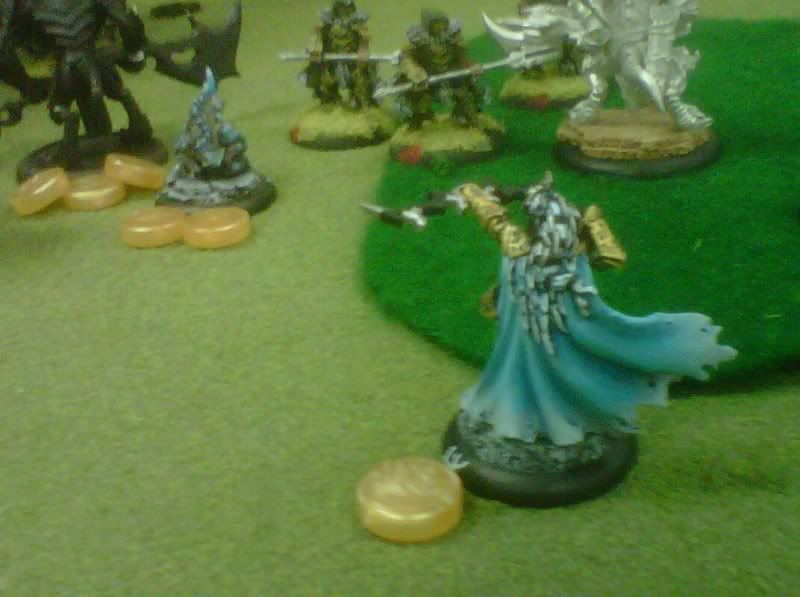
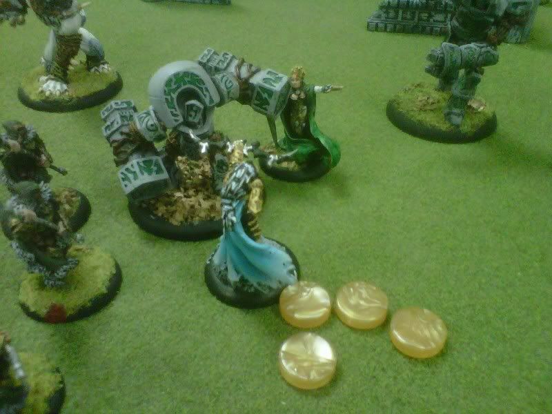
So, it's the 50th post! For something a little different, I have a few shots of my Legion models in action! I played a game against a former Press Ganger and veteran Circle Player, Menoth's Gambit. He thoroughly trounced me in a 50pt game, but it was quite fun and a great learning experience.

Pardon the shoddy photography, I took these with my Blackberry.

The circle army got the first charge, and before I knew it, I was down half my Legionnaires and all my beasts were at half health.  Lucky for me, Morvahna was fairly far up the field, so attempted an assassination run.

Lylyth plinks Morvahna, reducing her to 2 health
Unfortunately, it didn't work.  The next turn, Morvahna's beasts wiped out the rest of my spawn, leaving Lylyth with nowhere to transfer damage.  The Wold Guardian's auto-knockdown led to a quick demise...

Morvahna charges a knocked down Lylyth and stabs her to death
For those interested, here were the lists:

My list:
pLylyth
- Shredder
- Harrier
- Nephilim Bolt Thrower
- Nephilim Protector
- Carnivean
- Scythean
Striders + UA
Strider Deathstalker
Legionnaires (max)
Shepherd x2
Forsaken
Enemy list:
Morvahna
- Pureblood Warpwolf
- Woldwarden
- Wold Guardian
Wolves of Orboros + UA (full)
Bloodweavers (min)
Wolf Riders (min)
Shifting Stones + Stone Keeper
Druid Wilder
Blackclad Wayfarer
Wolf Lord Morraig

Yay for having painted models in action!

Wednesday, November 17, 2010

Lylyth Finished, Again

Huzzah!  Except for the one armor panel I see I missed, I do believe I'm happy with Lylyth at this point.

I hit the armor with Gryphonne Sepia, but I'm not sure it did much.  I then did a bold highlight of the armor plates in Burnished Gold.  I also painted the rope-y doodad hanging from her waist in white.  Lastly, I put down a heavy grey drybrush on the cloak to weather it a bit.

Here's the final result:


And from the tabletop angle:


Tell me what you think!

Lylyth tweak

So, I decided that I really, really didn't care for the yellow in Lylyth's hair.  It looked like a bumble bee, and the yellow just didn't fit with her look.  So, I whited out the yellow, used an Asurman Blue wash to cool the hair and then carefully picked out the hair strands in white.  The result is loads better.

I also didn't care for how the feathers looked like an afterthought - they were simply outlined in white.  So, I used the same wash to essentially ink their borders and darken them a bit.  Then, I went back over the white outlines.  The contrast is much sharper, and the eye is drawn a bit more towards the feathers.  Again, I think the model looks better.  Here's the shot:


This was the focus tonight - fixing Lylyth.  There are still a few details to pick out - the doodads hanging from her waist, a wash and re-highlight on the armor, and something on the quiver.  I'm also debating a bit of grey dusting around the edges of her cloak to weather it a bit since it's so tattered.

What you think about these changes to Lylyth?
What wash you think would look best on the armor: blue, black, brown or red?
Should I weather the cloak?

As added incentive to post a comment, here's a teaser for what's next!

Monday, November 15, 2010

Lylyth Finished

Other than a few minor details, here's the final product. What do you think?

PhotobucketPhotobucket

Leave a comment below!

Sunday, November 14, 2010

Lylyth WIP

So, after having gotten a beast figured out, my next task is a warrior type model. Since my goal is to finish the legion battle box first, I need to paint Lylyth. Here's how far I got:

PhotobucketPhotobucket

So, now I have loads of questions:


  • Do you like the gold/silver metals?


  • What about the cloak's shading?


  • What color should her hair be?


  • How should I do the metalics on her bow?


  • Let me know in the comments below!